Consolidate the information
Connect wellness units rather than making students search each one separately.
Resource Compass · Laurier · 2022
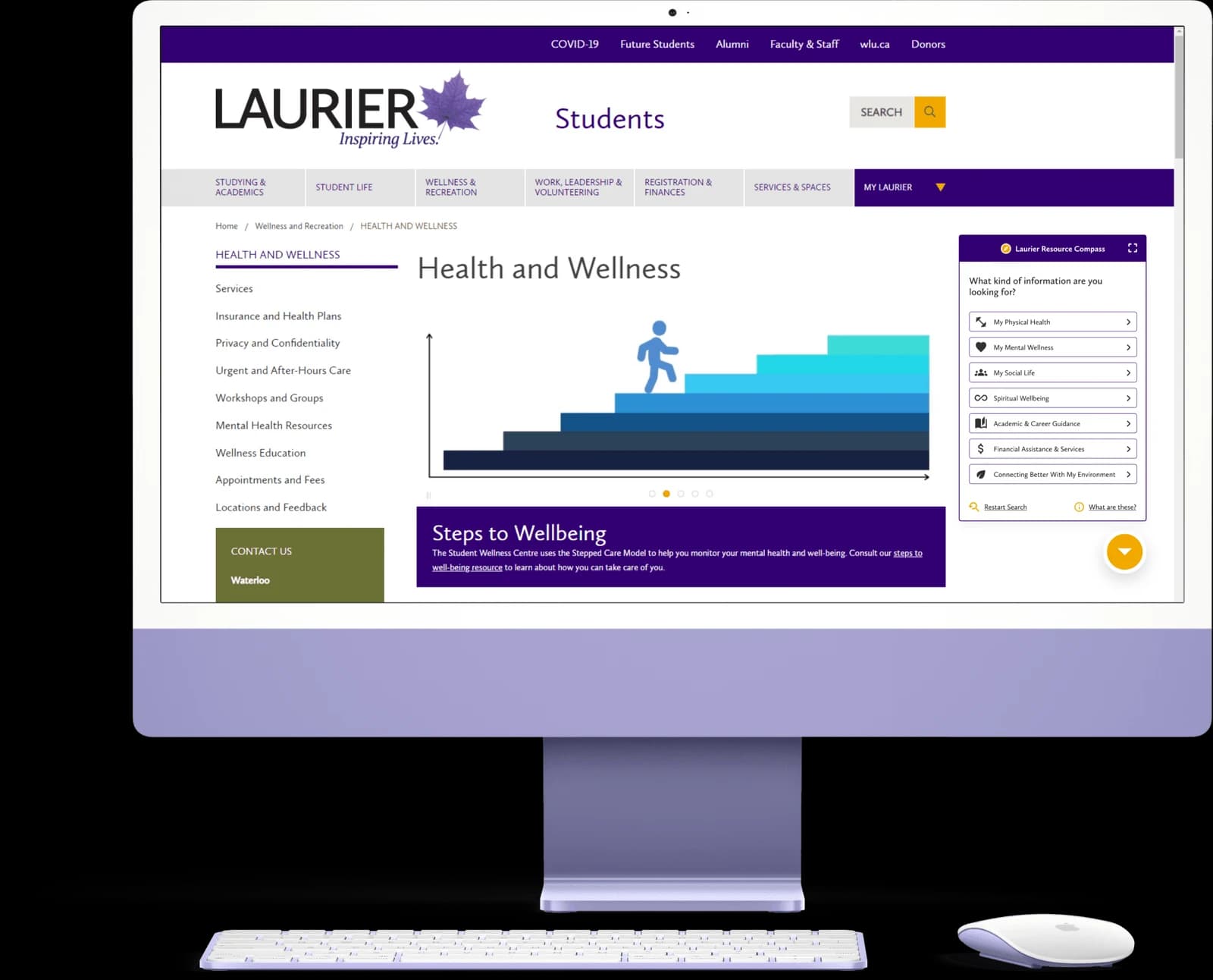
The help was there. Knowing where to start was another story. We designed a guided widget to help students identify the support they needed without learning the university’s org chart first.
My contribution
I owned all research, competitive analysis, and usability testing for Resource Compass. I compared Laurier with five other Ontario universities and used the findings to inform the team’s initial design decisions.
I worked with a six-person team and contributed to the initial design decisions. My role centered on the research and testing; the prototype and later interface design were team work.
01 / The problem
Laurier’s wellness information was divided across separate units. “Wellness” meant different things to different people, and students had to figure out both what they needed and which office could help.
The project followed a multi-campus student-wellness review initiated by the Deans of Students Offices in winter 2021, facilitated by Patrick Boot and Glen Lombard of Unless Design Partners. Our work took place the following winter term.
How might we improve resource awareness and take the burden of navigating wellness services off students?
Connect wellness units rather than making students search each one separately.
Help students recognize what support fits their situation, with digestible information and clear next steps.
Account for varied needs and urgency, while making people feel heard and supported.
02 / Research & needs
I compared Laurier with Guelph, Brock, Waterloo, Carleton, and the University of Toronto.
Across the sites reviewed in 2022, we found similar navigation challenges and an emphasis on mental health rather than an integrated view of wellness. Carleton’s resource finder offered simplified, digestible navigation, but finding the finder itself was a challenge.
We used the wellness-review data alongside unofficial student conversations on Spotted at Laurier and Reddit. These helped surface concerns, rather than serving as a representative student survey.
Serve all Laurier students, with a focus on undergraduates who had little experience with wellness services.
Students may know how they feel without knowing the name of the service they need.
Finding a resource is only part of it. Students also wanted their concerns acknowledged and support delivered in time.
We mapped the journey and developed user types to identify where the existing framework left students stuck. The artifacts helped us translate broad wellness needs into pathways a student could actually follow.
03 / Gathering resources
We inventoried 93 wellness-related resources, including the Wellness Centre, Academic Advising, and Financial Aid. An existing seven-dimension wellness framework gave us a starting structure.
The inventory distinguished educational resources, one-to-one support, peer support, and resources associated with the dimensions. It let us consider what a pathway should return before polishing the interface.
04 / Prototype & iterate
We moved from sketches to interactive prototypes, using journey maps to establish flows and Laurier’s website to align the widget with its branding. The team used usability heuristics to structure the initial screens.
Each version changed in response to usability sessions. The important corrections were about discovery and meaning, rather than simply making the screens more polished.
Early testing revealed a discoverability problem.
Team response: add an introductory pop-up or text box showing students where to find the compass.
Participants split between Mental Wellness and Academic & Career Guidance when seeking support for burnout.
Design implication: needs overlap, so pathways should not depend on one perfect category choice.
Participants associated the category with athletics, overlooking doctor’s appointments and other health services.
Team response: rephrase and redesign the Physical Health option to communicate its scope.
The participants tested were unaware of how many wellness resources Laurier offered.
Team response: add an information page explaining the categories and available services.
05 / The final pathway
The final prototype uses guided questions to move from a broad need to relevant support. The coursework pathway offers choices such as managing workload, finding math or writing support, and choosing self-guided strategies or one-to-one help.
The result cards bring services and practical access details together. The prototype also offers a restart, explanations, and an option to send the resource results to a Laurier email address.
06 / Testing & results
I conducted moderated usability testing with two separate groups of five participants, avoiding prior exposure to the other interface. The focus was first- and second-year students with limited experience navigating wellness webpages.
I assessed time on task, task success, SUS, confidence, and NPS. Scenarios covered finding social connection, support for school-related stress, urgent help, and information about the compass and its pathways.
The chart reports lower time for the Compass condition than the Laurier website condition.
The final report’s task-success chart shows a higher observed completion rate for Compass on this task.
These are descriptive results from two small, separate groups, not paired improvements for the same participants. Task 1 success stayed at 40%; Task 2 confidence was slightly lower for Compass. The findings show strengths and remaining work, rather than uniform improvement.
07 / Reflection & next steps
This was an early experience of working in a team that supported one another’s strengths and weaknesses. My biggest retrospective change would be adding a card sort earlier, so students could help define the categories instead of us guessing what the labels meant to them.
We explored three pathways. Completing and testing the remaining flows, and collaborating with wellness offices on content and maintenance, were proposed next steps rather than completed implementation.
Test the possible routes before implementation, especially when students cannot name the resource they need.
Work with wellness units on service integration, ownership, maintenance, and university growth.
Investigate whether guided discovery can also help students understand wellness and develop independent navigation skills.