Canada Post / Deloitte Digital / Experience design / 2026
A device swap shouldn’t restart your day.
I designed a session recovery experience for the 14,000+ Canada Post delivery agents using DIA Mobile, so they could resume work after replacing a failed device.
- My role
- Experience Designer
- Timeline
- June–July 2026
- Team
- Sole designer · 4+ developers
- Devices
- Honeywell CT40 / CT45 · Zebra TC57
My contribution
My work on the project.
- Sole designer: owned the recovery experience from problem framing to final screens.
- Mapped found, recovering, complete, partial, and failed states and designed their workflows.
- Designed category-level progress, selective recovery, skip confirmation, and mismatch warnings.
- Researched the rugged devices to determine button placement and interactions, and used Figma Agent to iterate on concepts.
Who I worked with
I was the only designer, working with 4+ developers and stakeholders across product, engineering, and Canada Post operations. I owned all design work: the recovery flows, screen layouts, button placement, and interactions.
The outcome
Approved by Canada Post and launched. I did not conduct usability testing, and post-launch performance metrics are not available.
When a device fails
DIA Mobile supports parcel scans, pickups, vehicle checks, and route management. Canada Post’s operating environment included roughly 14,000 delivery agents, 40,000 handheld devices, and 25,000 daily routes.
Up to 150 device swaps occurred on a typical day. A replacement device meant redoing work already completed on the previous unit. My scope was to help an agent safely resume that session without repeating activities they had already completed.
The problem I reframed
Engineering could restore a session from the backend. I focused on whether an agent at a busy depot could recognize the correct session and choose what to do under pressure.
Recovering the wrong session could compromise route data. Skipping recovery could permanently discard the previous work. I organized the experience around three questions: Is this mine? What happens if I tap this? Did it actually work?
Constraints and direction
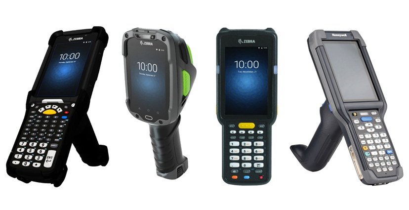
I researched the devices and iterated on the recovery concepts in Figma.
Agents use rugged Honeywell and Zebra devices outdoors, one-handed, and sometimes with gloves. Recovery happens at shift start, often with a queue behind them. I prioritized large targets, clear type, and few decisions.
I used DIA Mobile’s existing visual patterns so the recovery flow would feel familiar. Backend recovery was largely all-or-nothing; the interface still needed to explain partial and failed outcomes clearly.
I researched the devices being used to inform button placement and interactions, mapped system states, and designed the decisions within them. I used Figma Agent to iterate on concepts and reviewed directions with stakeholders. The brief was to add recovery flows and screens that fit the current app.
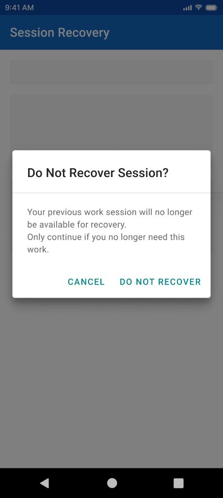
Explain what skipping will discard
I designed the confirmation that protects the agent’s previous work.
I identified Skip as the most dangerous control: it permanently makes the previous session unavailable. A visually ordinary button did not communicate that consequence.
I added a dedicated confirmation with plain-language consequences. I kept that extra dialog for the destructive action while removing unnecessary interruptions elsewhere in the flow.
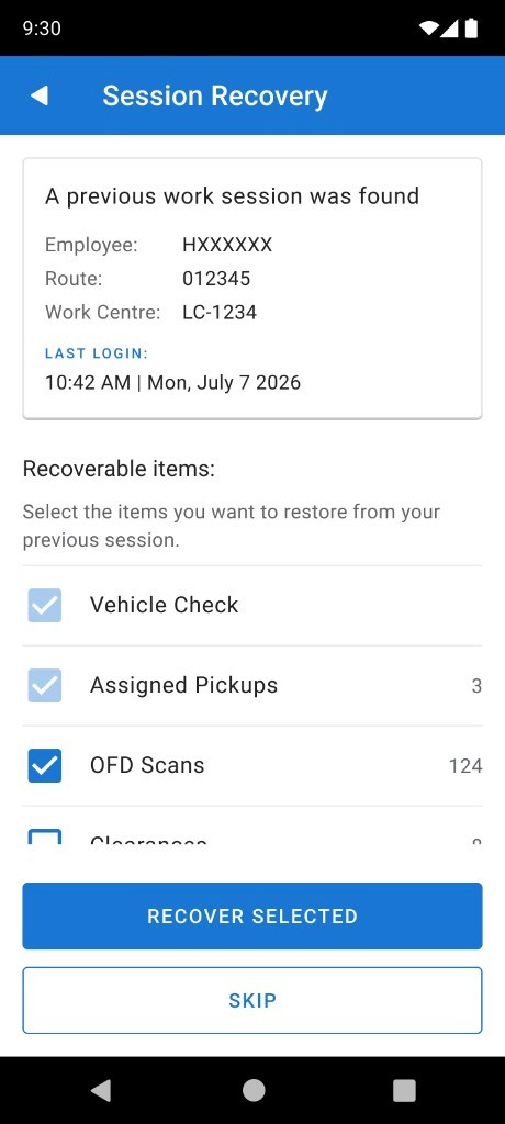
Identify the session before recovery
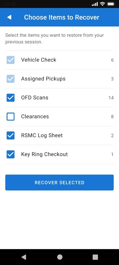
I designed the session summary and selective recovery interactions.
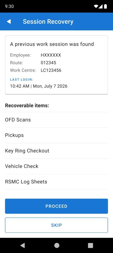
I put employee ID, route, work centre, last login, and recoverable items before the recovery action. The agent can establish whose session this is before making a choice.
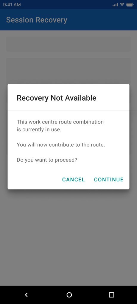
I designed recover-all and selective recovery paths. A work-centre mismatch warning handles the situation where the recovered route does not match the current work context.
Show work returning
I designed progress by work category, with counts and status.
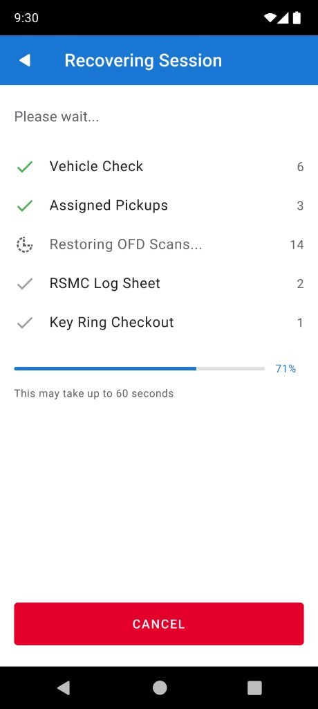
I replaced a generic loading state with category-level progress for Vehicle Check, Assigned Pickups, OFD Scans, RSMC Log Sheet, and Key Ring Checkout. Each category shows counts and status.
An overall percentage and an ‘up to 60 seconds’ expectation make progress visible. The agent can see which items are coming back and how long recovery is expected to take.
Handle complete, partial, and failed recovery
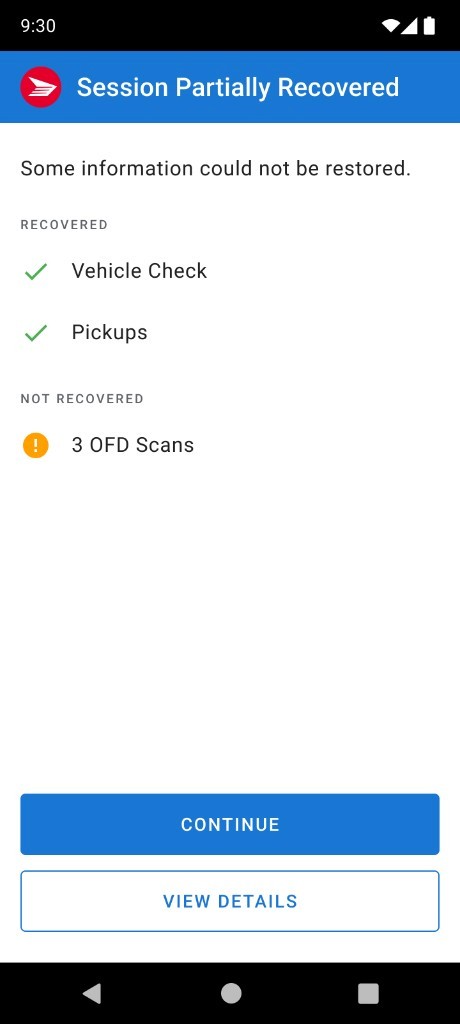
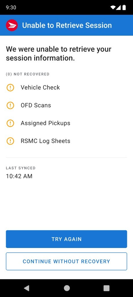
I designed complete, partial, and failed recovery workflows.
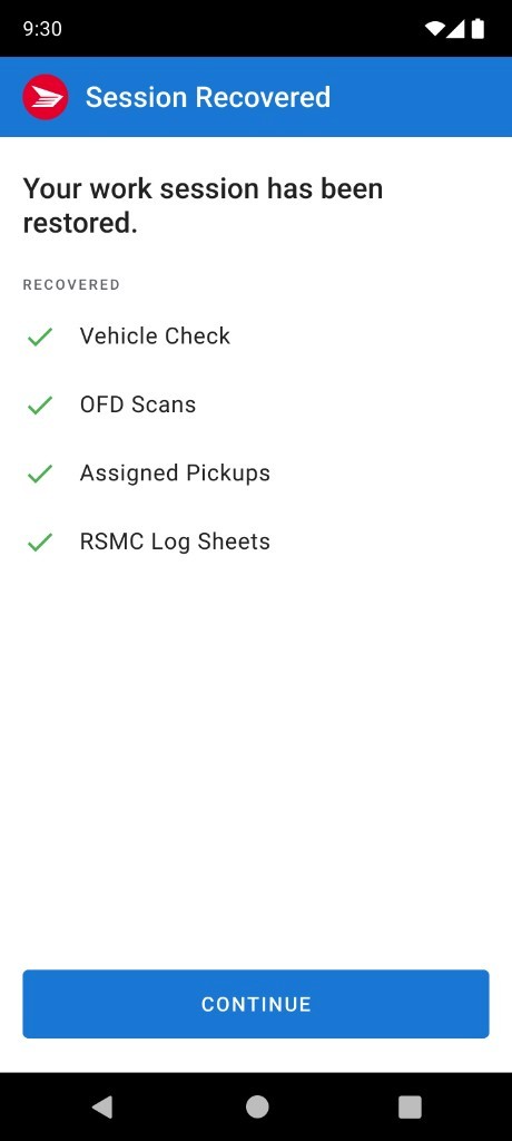
I designed complete, partial, and failed recovery as distinct outcomes. Complete recovery confirms what returned. Partial recovery distinguishes recovered work from missing work, even though partial recovery is an API edge case.
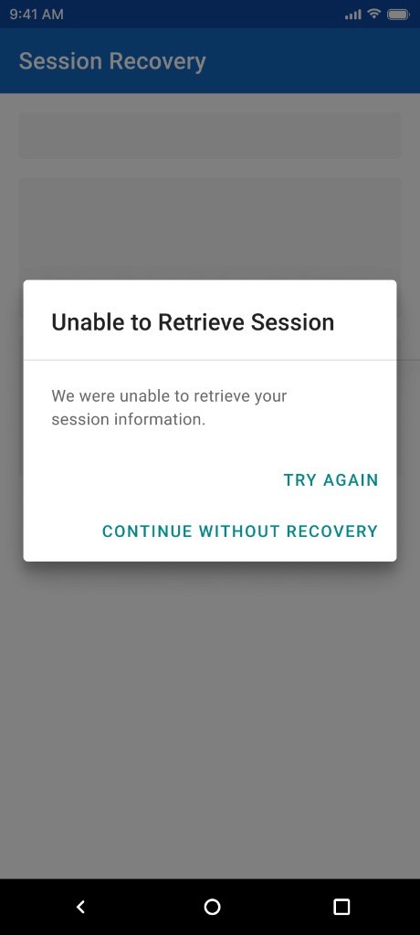
Failure offers retry and a way to continue the shift without recovery. Each screen explains the outcome, shows what happened to the work, and gives the agent a next step.
Fit the existing app
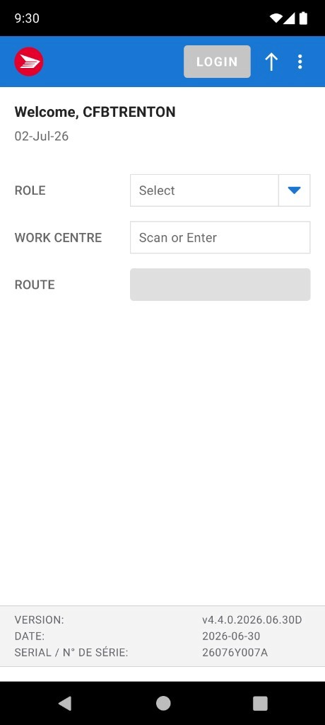
I created new screens within DIA Mobile’s existing design language.
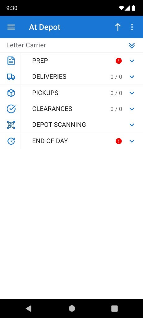
I extended DIA Mobile’s existing patterns: large type, oversized controls, and minimal decoration. Agents could use familiar controls in the new recovery flow.
These supporting screens show where recovery sits in the daily workflow and how failure or mismatch conditions let the agent decide what to do next.
Review and approval
I presented multiple concepts to support decisions across product, engineering, and operations. Canada Post approved the final recovery experience in the final stakeholder review. The flow was subsequently launched.
The deliverables included the recovery state machine, end-to-end flows, category-level progress, error and edge-case handling, and screens aligned with the native app language.
I did not conduct usability testing before launch. Task completion times, adoption, and error rates have not been measured in this case study, so I cannot claim a quantified improvement. Field validation of session selection, accidental skipping, and failure recovery would be the next step.
What I took away
I learned to check what an agent needs to know before asking them to act. In this flow, that meant identifying the session first, showing what was being restored, and explaining complete, partial, and failed recovery.
Gloves, glare, time pressure, and rugged devices affected the choices I made about text, target sizes, and interactions. The recovery screens needed to be clear enough to use during an already difficult moment.
Keep exploring