Keep the map. Move the work into a sheet.
I replaced the custom container with native sheet detents and adaptive light/dark chrome. The existing dark V1 detail remained intact.

Go Train Watch Independent product · 2025–2026
I wanted to know when to leave. Somehow, I was learning line codes. So I designed and built a calmer way to plan a GO trip and keep an eye on it.
My contribution
I was the solo UX designer and native developer. I owned the information architecture, interactions, visual system, onboarding, Pro paywall, and SwiftUI implementation.
I iterated through my own commute, real-device testing, TestFlight feedback, and diagnostics. Every interaction also had to work with Metrolinx’s data, native sheets, and background updates.
How I worked
I designed and built Go Train Watch end to end. There was no separate handoff team: every pattern had to compile, ship, and survive TestFlight.
I chose the references, framed the problems, made the navigation and scope calls, and decided what was ready to ship. Cursor shortened the implementation loop; it did not make those decisions for me.
Platforms, delays, and “is my train still running?” came from using GO myself. Dogfooding gave me a starting point, not a substitute for formal rider research.
Flighty was my primary interaction reference. Mobbin helped with specific gaps: Calm-style reminders, Hatch-style time picking, and Too Good To Go-style pickup windows informed departure windows and weekday chips.
Figma tracked the seven-step onboarding flow and marketing frames. Living product notes kept tabs, Pro gates, decisions, design tokens, and known gaps consistent across sessions.
Where AI helped
I used Cursor for context-loaded SwiftUI implementation, parallel exploration, and search → patch → test loops. That helped me move from a chained-field idea to Add Route animations, resolve bus aliases, and trace theme and launch bugs.
Problem framing, IA, visual taste, and acceptance stayed mine. I chose to remove Ask GO, keep bus Live Activities out of scope, and move Settings off the tab bar. TestFlight feel, diagnostics, and tests still decided whether a change stayed.
I built with SwiftUI, WidgetKit, ActivityKit, StoreKit, and a Live Activity push server. Project rules load memory.md first; .ux/ context, decisions, and design-system notes carry product intent into scoped implementation work.
The dated changelog records shipped changes, reverts, and open issues. Central haptics and shared FlightyTheme / ShellTheme tokens kept generated patches aligned with the app.
My supporting pattern research included tabs and dark mode, plus segmented controls and dark mode.
V1 → V2
V1 proved the data, tracking, widgets, and StoreKit in a classic dark tab shell. But the map felt like somewhere to visit, rather than context that stayed with the trip. Planning and tracking competed for attention.
I migrated to a map-first shell behind a feature flag, reused the working trip engine, and kept V1 available in debug Settings for side-by-side regression checks.
I replaced the custom container with native sheet detents and adaptive light/dark chrome. The existing dark V1 detail remained intact.
Tracking merged into My Trains. Trips gave way to Routes and Union; Settings moved to the Search gear. These were staged experiments, not one perfect first sketch.
I reverted the bus-heavy Routes header. Routes stays a rail corridor board; Add Route handles bus numbers and stops. Bus journey UI shipped, while Live Activities remain train-only.
Bento, Solari, and metro-schematic departure concepts stayed prototypes. I removed Ask GO, ads, and the standalone Planner, while keeping deterministic Siri/Shortcuts.
V2 became the default while V1 stayed behind a debug flag. This was a migration with comparison and reverts, not a production A/B experiment with measured conversion results.
01 / Okay, the timetable isn’t the whole problem
“Brampton to Union. When’s the next one? Which platform? Will I still know what’s happening when I leave the app?”
My commute gave me the starting point: planning felt harder than it needed to. Wrong defaults and opaque line filters got in the way. At first, a better timetable seemed like the answer.
Then I realized the timetable was only half the job. Once I had picked a train, I still wanted to know what was happening without babysitting the app. My working hypothesis became recognizable places, clear status, and continuity outside the app. The audience was inferred from my commute and research; it was not a formally validated persona.
How might we help riders plan and follow a trip using places and routes they recognize, in an interface that remains useful in the background?
My commute and dogfooding, competitor and interaction-pattern research, real-device testing, and documented product gaps.
Plan a trip in roughly 30 seconds, save it to My Trains, and optionally start a Live Activity. This is a design target, not a measured result.
Replace GO ticketing, add accounts, or promise address-to-address planning. Ticket purchases link out; walking legs were deferred.
02 / Research & inspiration
I reviewed these GO apps to understand how they present corridors, departures, and disruptions. These observations refer to the supplied screens; they are not a usability benchmark or a claim that the competing products cannot do more.
I wanted to keep that scanability while giving unfamiliar riders geographic context before they choose a corridor.
Status deserves this prominence. My direction extended it into saved trips and lock-screen continuity.
The selected line and stations anchor the screen. I explored a map-first alternative for riders who do not already know the corridor.
Borrowing the feeling, not the flight
Flighty’s experience inspired three principles: treat a trip as a tracked object, make status glanceable, and continue the experience on the lock screen. I adapted that direction to commuter rail and bus constraints rather than copying flight terminology.
03 / Design decisions
I kept the map visible and placed trip work inside a native sheet. Riders can orient themselves without abandoning their plan.
I designed entry through a route number, a station pair, or a single stop. Chained fields shrink into chips so attention stays on the active field.
I kept schedules, maps, alerts, and favorites in the free experience. Pro focuses on widgets, platforms, reminders, and tracking.
I used honest unavailable-data states and mode-specific language: Gate for buses, Platform for trains. Live Activity tracking remains train-only.
04 / The experience
I built light and dark map surfaces around the same hierarchy. A sheet lets the rider move between geography and departures while keeping the route in view.
I brought train lines, bus routes, and stops into one search direction. Mode-aware badges and gate/platform language help the selected journey make sense.
I grouped timing, platform information, ticket links, and alerts in trip detail. Saving a train gives it a home in My Trains, separate from the browsing experience.
I designed boarding and arrival phases to change with the journey. Widgets and Live Activities make the next important detail visible without reopening the app.
I designed a destination notification to remind riders to tap off their PRESTO card and show the weather as they get ready to step outside. It brings the last practical task into the journey, rather than leaving it to memory.
I changed the welcome reminder from a fixed “three minutes before arrival” trigger to a proximity-based trigger within 1.5 km of the destination, or confirmed at the platform. Scheduled arrival is the fallback when live train coordinates are unavailable.
A delayed train should not welcome someone to a station they have not reached. I covered the arrival logic with unit tests and added a live server arrival milestone to handle stale scheduled notifications.
I designed home-screen widgets so riders can check their next departures without opening the app. Time, platform, and live status form a compact hierarchy across widget sizes. When no departures are available, the widget says so clearly instead of showing an empty or misleading board.
05 / Test & iterate
I used API-fixture unit tests, shell UI tests, TestFlight, real-device checks, and diagnostics correlated with server logs. These are implementation and beta validation methods; I did not run a formal user research program for v1.
A bus terminal code was being resolved through a rail alias.
I made the catalog’s stop kind authoritative so a bus request stays a bus request.
The Live Activity used the full line geometry, including skipped stops.
I built the journey spine from served stops only and added a unit test.
Each newly received alert generated a separate push.
I batched updates into one summary so the notification respects the rider’s attention.
The paged presentation did not respect the intended appearance.
I used a UIKit appearance override so onboarding text remained visible in Light Mode.
MapKit and tab tasks competed at startup; an internal report described a 3+ minute hang.
I gated launch, deferred tab mounting, and delayed catalog refresh.
Still open: better picker defaults for line-unaware riders, and a formal accessibility review beyond spot VoiceOver checks.
06 / Brand & delight
The home-screen icon is the first brand touchpoint. I wanted it to feel alive through Ontario’s seasons. But a little seasonal delight should not leave someone wondering who changed their home screen.
I designed and implemented four icon variants, a seasonal picker, and consent-first offers. The icon changes only when the rider chooses to switch.
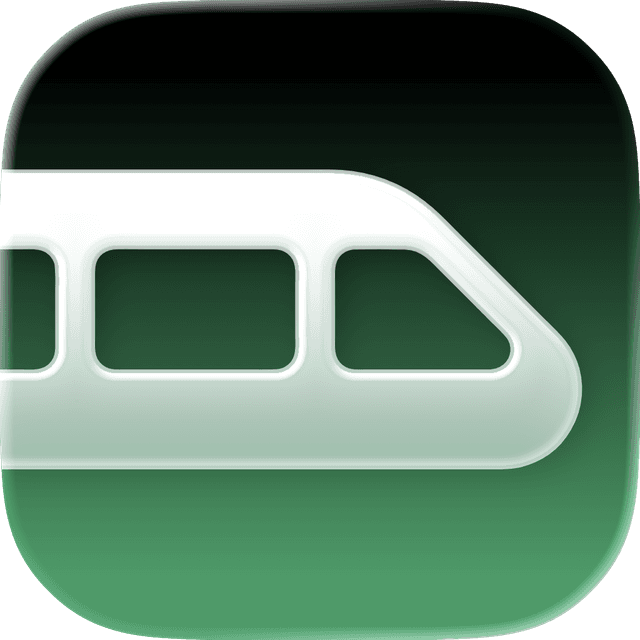
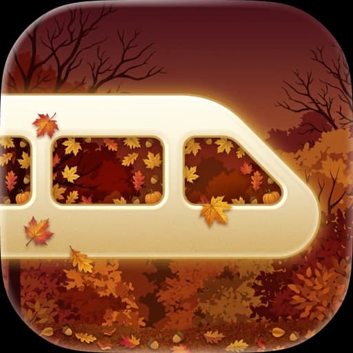

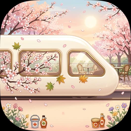
iOS shows a system confirmation saying “You have changed the icon…” after an alternate-icon switch. That wording feels misleading if the app made the decision silently. I kept seasonal changes out of the background.
“Automatic (Seasonal)” is on by default, but it enables an offer, not a silent swap. On launch, a new season triggers a warm toast: “🍁 It’s fall! Switch to our cozy Fall icon?” Tap to accept; dismiss to keep the current icon. Settings also offers a manual override, month ranges, and a “Current season” badge.
Matching AppIconPreview assets appear in Settings, onboarding’s notification mock, and marketing. The notification looks like the actual app, rather than a placeholder glyph.
On gotrainwatch.ca, tapping the nav icon cycles Default, Fall, Winter, and Spring. The choice persists locally and updates the favicon too.
I used a custom CN Tower tab for Union, GO roundels tinted to line colors with abbreviations, and bus capsules using GTFS route colors. UP Express gets its own wordmark chip: different operator, different identity.
AppIconManager centralizes setAlternateIconName, current-icon synchronization, and the Ontario season calendar. AppIconManagerTests cover that calendar, including a one-time 2026 rule keeping September on Default before Fall starts in October.
07 / What I can honestly claim
I designed and implemented a native product covering trains, buses, UP Express, Union departures, onboarding, and Pro follow-through. The project is in TestFlight beta and App Store preparation.
I also shipped seasonal app icons with opt-in offers, a manual Settings override, a web favicon easter egg, and a tested season calendar. It is a deliberate delight layer that respects iOS’s limits.
I shipped V2 as the default while preserving V1 for regression checks. The dated changelog records ongoing tab experiments, bus scope changes, alert fixes, and tracking corrections. Figma, Mobbin, Cursor, TestFlight, and diagnostics each served a different part of that loop.
The iterations corrected known mode-resolution, notification, and tracking defects. Without an in-app analytics dashboard or a formal study, I cannot claim measured gains in planning speed or rider confidence.
Cursor’s biggest contribution was compressing implementation cycles while holding product context. That gave me more room to work on IA and trust. Mobbin helped me ask how shipped apps solve a specific interaction; constraints and iteration determined what belonged here.
The V1-to-V2 lesson was to keep the proven core and question the shell. Engine reuse, feature flags, and a willingness to revert made the redesign manageable.
Alternate icons taught me that platform copy is part of the design. Apple’s confirmation string cannot be customized, so I designed the seasonal toast around it. Working with that constraint made the interaction more honest.
My highest-leverage design work happened where API reality met the UI metaphor, rather than in another card shadow.
Next, I would interview 5–8 riders at Union and Brampton GO during peak travel.
Test Add Route against the official GO flow using time to a first correct itinerary.
Run a structured Dynamic Type and VoiceOver pass on Routes, trip detail, and the alerts sheet.