Global Public Health Intelligence Network (GPHIN Collaboration Hub)

The GPHIN collaboration hub: An information management platform that collects, filters, classifies, and flags media reports from primarily international sources, to enable analysts in their work.
Sector
Federal government
Public health
Tools
Team
2 UX designers
3 Developers
Timeline & Status
6 Months (Budget constraints cut the design team half way through)
My Role
UX Designer — Interaction Design, Design system, User Flows, Developer Handoff
Overview
Early in the COVID-19 pandemic, GPHIN faced media scrutiny as Canada failed to use its pandemic early-warning system appropriately, leading to an independent review with recommendations for modernization.
I transformed concepts into impactful designs of key user flows such as user auth, user management and a flag list page for the new web app, translating user stories into high-fidelity prototypes with a strong emphasis on information architecture and accessibility.
I also collaborated with the design lead to establish the foundation of a new design system for future proofing and a guide for developers.
Design process
Sprint Planning
Low-fi prototype
High-fi Prototyping
Final Design Handover
User Story Review
Design Review
Dev Meeting
Iteration and Refinement
Final Design Handover/Documentation
Outcomes
A complete redesign of the GPHIN web app with improved flows that help foster collaboration with external health officials.
Improved user management control to Administrators compared to excel sheets and emails
Improved flag management process by building a more useful table and integrating filters
Problems
Operational Inefficiencies: Analysts spent excessive time reviewing irrelevant information. Which led to delays in identifying public health threats.
Lack of accessibility: Current platform did not meet (WCAG) 2.1 accessibility standards.
Aging technology: The outdated system hindered PHAC’s ability to respond swiftly to public health emergencies.
Current design

Outdated and limited system (Flagged articles from multiple countries screen)
How might we
transform GPHIN into a more intelligent, interoperable, and collaborative platform that empowers the public health community to effectively conduct global surveillance and respond to emerging threats?
Context

The Public Health Agency of Canada is part of the federal Health Portfolio. Its activities focus on preventing disease and injuries, responding to public health threats, and providing information to support informed decision making.
What is GPHIN?
The Global Public Health Intelligence Network (GPHIN) was set up as a global network of connected professionals working to rapidly detect, identify, assess, prevent and mitigate threats to human health. Formed in the late 1990s by the Government of Canada (Health Canada) in collaboration with the World Health Organization,
GPHIN System Failure
The system failed to alert public health regarding COVID when it was needed the most.

Design principles
Accessibility
Ensure it is usable by people with disabilities (e.g., screen reader compatibility, keyboard navigation, color contrast) and comply with WCAG.
Findability
Provide users with robust search functionalities to extract relevant data effectively.
Error Prevention
Reduce the likelihood of user errors by designing intuitive workflows and providing clear guidance.
Clear Navigation
Ensure users can effortlessly locate the information and features they need.
Design Challenges
Direction
Pre-existing mockups were provided by project leadership, limiting design exploration and iteration. Our task was to translate these existing concepts into high-fidelity prototypes.
Design System
Adherence to the Canada Design System was discussed, but ultimately deemed unsuitable for the app's specific niche.
Research
Due to project timelines, formal user research to identify specific user needs, problems, and pain points was not conducted. Design choices were based on pre-existing mockups and general best practices rather than direct user feedback.
Approach
Starting fresh. One story at a time.
My approach was to look for inspiration in similar apps or sites and work quickly during sprint and try to validate design in meetings. Then communicate with developers if design is feasible.
Design Solution
I redesigned certain parts of the GHPIN collaboration hub based on use cases and problems that analysts and other health officials faced daily which slowed them down while flagging articles down.
This was informed by previous research done by the GPHIN technical team.
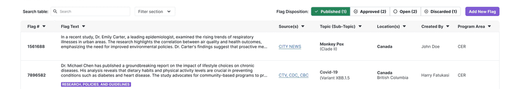
Flags page
Focus on What Matters
Rather than trying to display irrelevant table columns , I decided to transform this page to be more specific and useful to the user based on what they are likely to look for, which provided more context. The GPHIN Operations team gave feedback that whats most important is providing context and reducing the manual labour of identifying flags.

Added location and topic, subtopic and a unique identifier number for each flags
To enable precise tracking, referencing, and management of individual flags when communicating
Added 'Created By' and 'Program Area' columns
To improve accountability and streamline the review process for efficient workflow management
Inspiration from github's SubNav
During meeting discussions with the project manager, they needed a feature that lets users filter the table but without using drop-downs as we already had many on the page.
After multiple attempts in exploration and brainstorming, I discovered this feature and implemented it to match our design system. The best use case was when users need to see different flag statuses.
Developers faced issues when implementing it on smaller screens so we advised them to change it to a dropdown when the width decreases.

Feature integration
User Management page

User Status Management
Previously, administrators had limited control over the users that use the application and had a manual process that required constant emailing, which had posed a security risk.
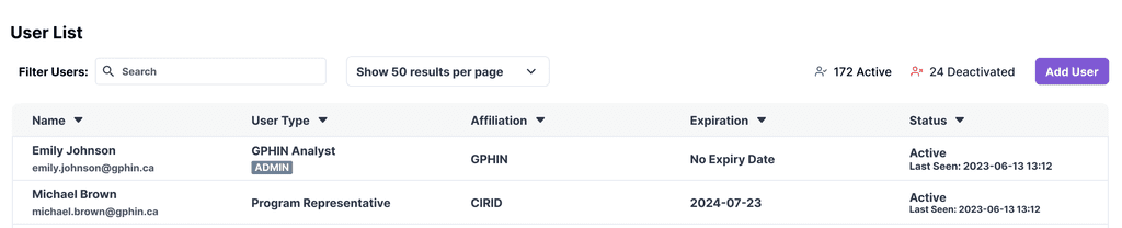
Account Expiration and status
Designed to ensure that external researchers or internal users only have access for the duration of their collaboration.
Tooltips
Added tooltips to the GPHIN app to reduced cognitive load, provide contextual help and improve accessibility.

Explaining icons and certain actions
Designed to subtly guide users to discover less obvious features or functionalities that they might otherwise overlook.
Session Time out Modal
A crucial security measure design feature for GPHIN, especially given the sensitive nature of public health data to preventing unauthorized access.
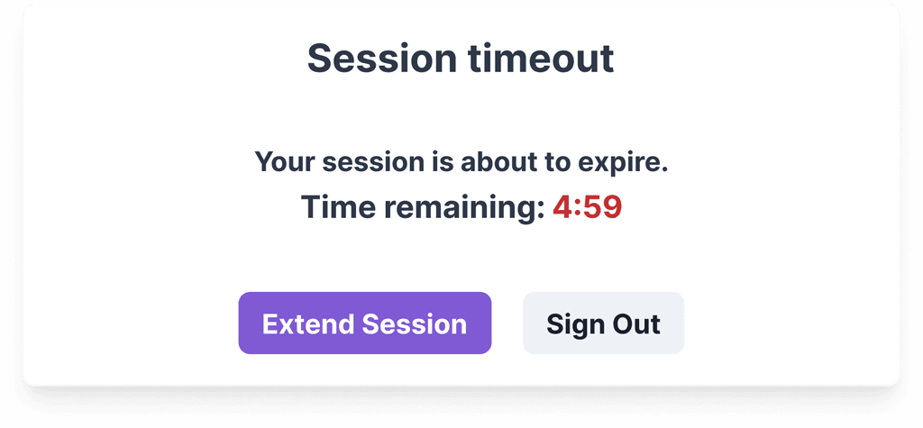
Making it simple to explain what is going on in the modal to the user
A modal that clearly communicates the reason for the impending timeout ("Your session is about to expire") and provides clear options
"Time remaining: 4:59" Countdown
Providing a clear visual cue of how much time the user has before the session expires, prompting them to take action.
"Extend Session" Button (Primary)
Offering a convenient way for users to continue their work without interruption. This is needed to be the primary action after discussing with the users, so it's appropriately highlighted adhering to design system.
"Sign Out" Button (Secondary): Provided an option for users to manually end their session if they are finished working.
User Authentication High level flow
Creating a new password process
1
2
3
Emailed link - Password creation
To improve both accessibility and usability, I chose to display password requirements as static text with dynamic updates so the text reflects compliance in real-time. Originally, banners were adding up in the page when user fails to meet all requirements.

Password creation partial state
My aim was to offer continuous guidance, so as the user enters characters, the password requirements dynamically update. This gives users immediate insight into which criteria they've met and which they still need to fulfill, minimizing errors and frustration.

Password creation success
The success state provides explicit confirmation to the user that their password has been successfully created, as well as a clear call to action, guiding users to log in. This reduces anxiety and ensures they know the process is complete.
